Recognition, Built to Last
Client: University of Advancing Technology (UAT)
Agency: FabCom
Art Direction, Design & Production Management: Monique McKenna
Production/Fabrication: FASTSIGNS® of South Scottsdale
The University of Advancing Technology sought a permanent way to recognize faculty and staff who exemplify its core values each year. The project required a long-term recognition display honoring ten recipients annually across ten distinct values while remaining durable and visually meaningful over a projected ten-year lifespan. With the direction intentionally open, the client invited concept options to evaluate impact against budget.
Pushing beyond the expected, I reframed the piece as environmental signage and presented solutions ranging from a fully realized version with all the bells and whistles to medium, and finally a more budget-friendly approach. My process centers on building a strong core design first, then layering materials, finishes, and dimensional elements that can elevate the piece as investment increases. This ensures every option stands on its own while illustrating the value of enhanced execution.
The result transforms employee recognition into a prominent campus feature that reinforces UAT’s culture while creating a lasting symbol of celebration and pride
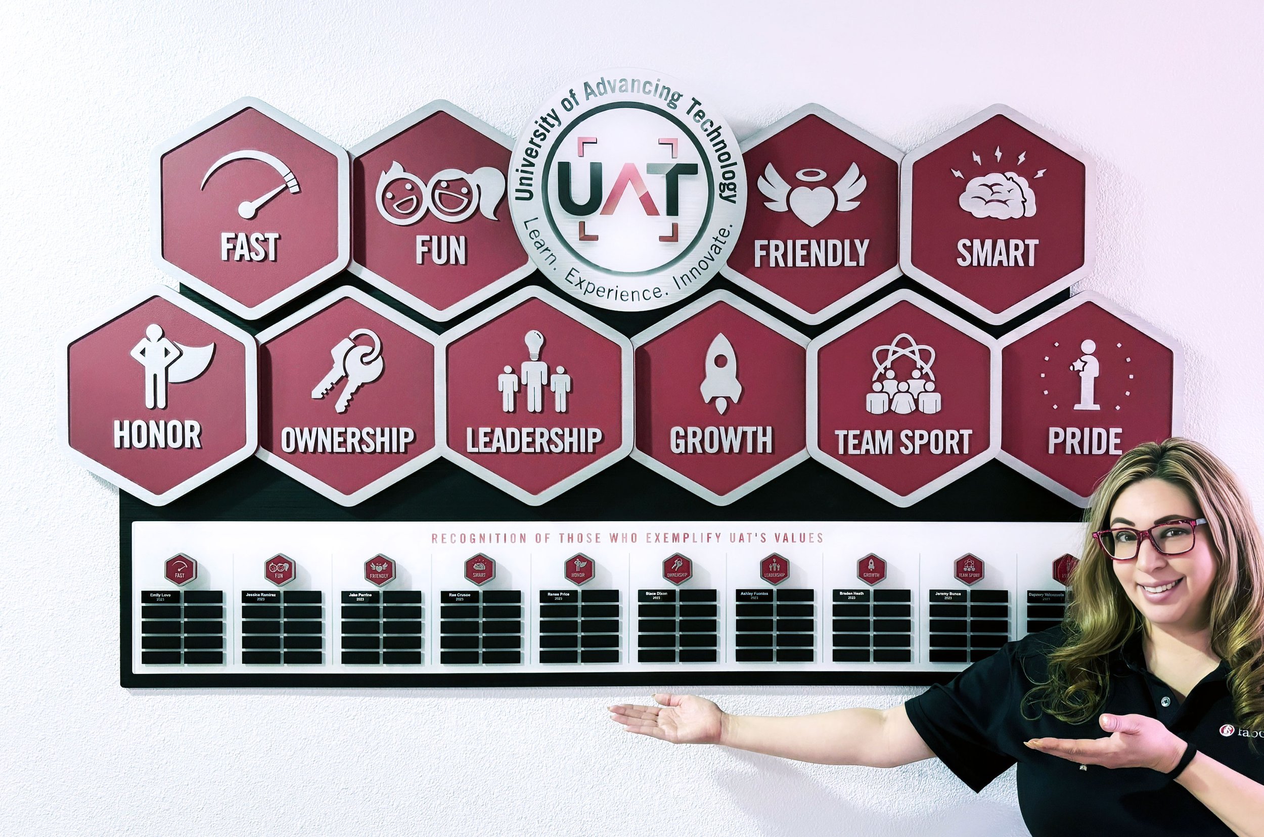
On campus with the completed UAT Values recognition plaque.The Process
Building on an Existing System
The project began by building upon the core-value iconography I had previously developed for UAT, ensuring continuity with the university’s broader brand ecosystem. The structural direction was further shaped by a hexagonal format introduced by creative director/designer Sean Appleman in a related apparel design for UAT. Incorporating this geometry helped align the display with existing branded materials while creating a modular framework in which each value could stand independently yet function as part of a cohesive system.
Designing for Longevity and Change
Because the recognition program was designed to span ten years, adaptability was a critical requirement. The university needed assurance that individual values could be updated if the program evolved, without replacing the entire display. Achieving this required extensive brainstorming with the fabrication partner to explore durable, serviceable solutions that would hold up over time. I often approach these conversations by proposing possibilities beyond standard specifications, which encourages vendors to think more creatively about what is achievable. In many cases, this collaborative exchange surfaces alternative techniques, materials, or construction methods that might not initially be proposed.
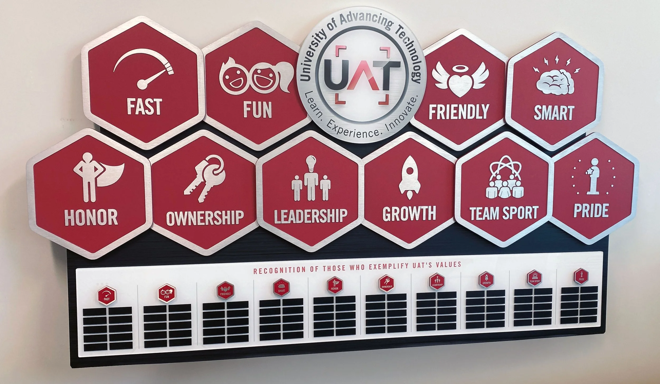
Each hexagonal element was ultimately engineered as a removable component secured with concealed magnets, allowing values to be swapped efficiently and cost-effectively while preserving the overall structure.
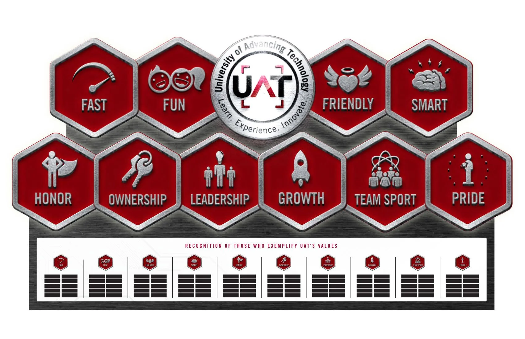
Translating a large, dimensional object from concept to reality required more than flat artwork. Clients often struggle to visualize scale, materials, and depth from vector layouts alone, so I developed progressively realistic representations to communicate intent. The process began with photorealistic digital renderings, followed by a physical miniature mockup. This tangible model helped refine proportions, communicate expectations to the fabrication partner, and give stakeholders a clear understanding of how the final piece would function in space. It also served as a valuable reference throughout production.
Visualization and Prototyping
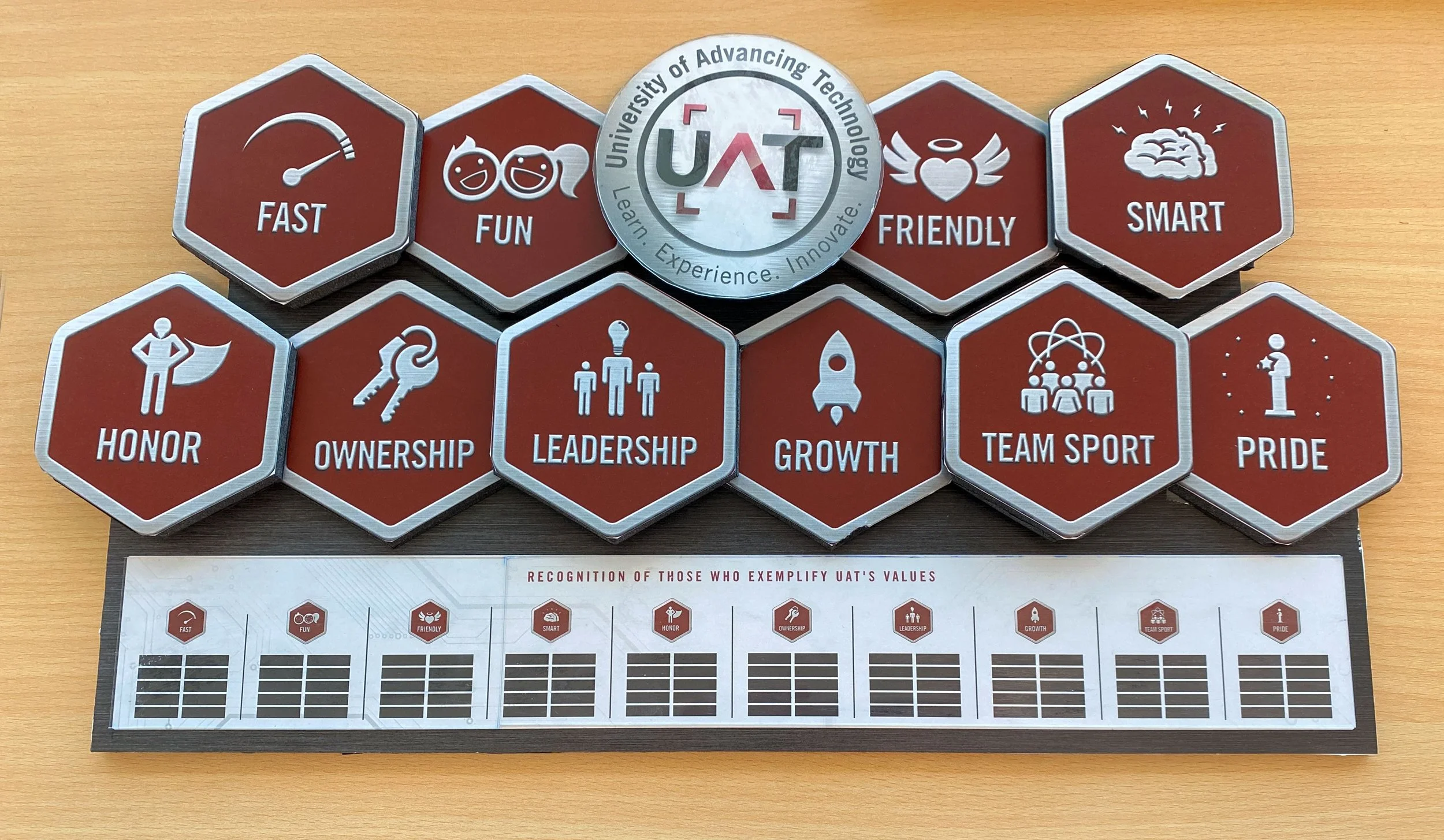
Designing for physical production required flexibility. Details that worked in flat artwork did not always translate cleanly into dimensional metal, so elements were refined to ensure clarity, durability, and visual strength at scale.
Designing for Fabrication


Material selection was guided by UAT’s modern, technology-forward environment, which frequently incorporates brushed metals and industrial finishes across campus signage. Each value icon was fabricated as a dimensional metal element with recessed color fields, creating durability while reinforcing the institution’s contemporary aesthetic. The central UAT mark was produced on thick acrylic to preserve color fidelity and establish a dominant focal point without introducing unnecessary fabrication complexity.
Materials and Finishes
The lower recognition area extended the modular approach at a smaller scale. Miniature hexagonal markers, similar to challenge coins, were mounted magnetically above engraved nameplates, allowing new recipients to be added annually without altering the primary structure.
Modular Recognition Elements
The backing panel required careful balance between visual impact and practicality. While a full metal substrate would have achieved the desired appearance, it introduced unnecessary weight and cost. Instead, a rigid foam core panel faced with brushed black aluminum veneer delivered the same premium look while significantly reducing weight, expense, and installation risk.
Structural Solution
Early concepts also explored higher-end enhancements, including full metal construction and integrated backlighting. Ultimately, the selected configuration balanced presence, durability, and value while maintaining the integrity of the design.
Evaluating Premium Options
Final Outcome
The result is a durable, adaptable display designed to look as strong years from now as it did on installation day. By prioritizing both visual impact and long-term functionality, the piece supports the recognition program while reinforcing UAT’s culture in a tangible, lasting way.
Work created as part of my role at FabCom.
All brand assets remain the property of their respective owners.